First of First
I personally think there are two important concepts in video game graphic design. Consistency and Brightness Grading.
Consistent graphics, allow players to get the immersive feeling more easily. It creates the feeling that the game is well-polished. Make the content appear confident to the player.
Human eye is familiar with 3 dimension world. However, the computer screen is flat. So, creating a graphic that can easily be picked up and understood is important. Otherwise, the play process needs a lot more effort to recognize objects in the scene.
Today, I will give some examples to briefly demonstrate these two concepts.
Persona 5

What makes playing Persona 5 so enjoyable? I think one major reason for its success is its appealing graphics.
Example: Clear Brightness Grading

- Layer1: UI
- Layer2: Character / Light Source
- Layer3: NPC / Background
Elements in Persona 5 have a brightness level depending on their priority.
The first layer is UI. UI displays the most important information in Persona 5, which is the date under the current play state. Always showing UI at the brightest layer. Make players feel safe because they don’t need to constantly worry about missing the boss fight.
The second layer is the main character and light source. All the other objects(NPC and the background) are not involved in the game story. This helps the player to catch the main event going on the screen with less distraction.
Example: Consistency Makes Content Easy to Pickup

In grayscale mode, the brightness of the content is consistently presented.
The brightest objects are the UI, the characters, and the light source.
As long as the game graphic follows the same rule. Once the player is familiar with the different brightness levels of each element. Players will learn some kind of “vision memory” about the game. This make the game graphics feel predictable and reliable.
Overwatch
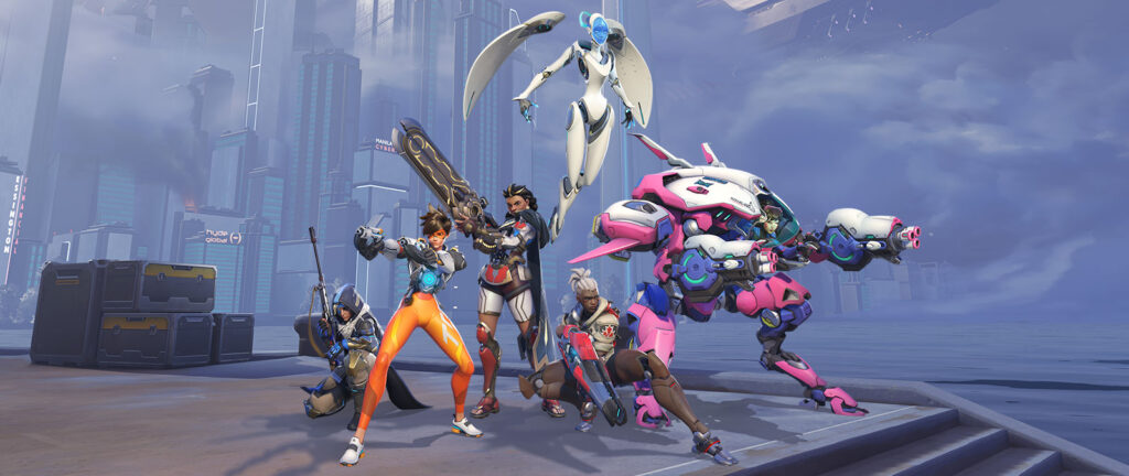
Overwatch is a well-designed multiple-player hero shooter game. The level design of overwatch is not only functional but also can be easily recognized visually.
Example: Clear Brightness Grading For Critical Area
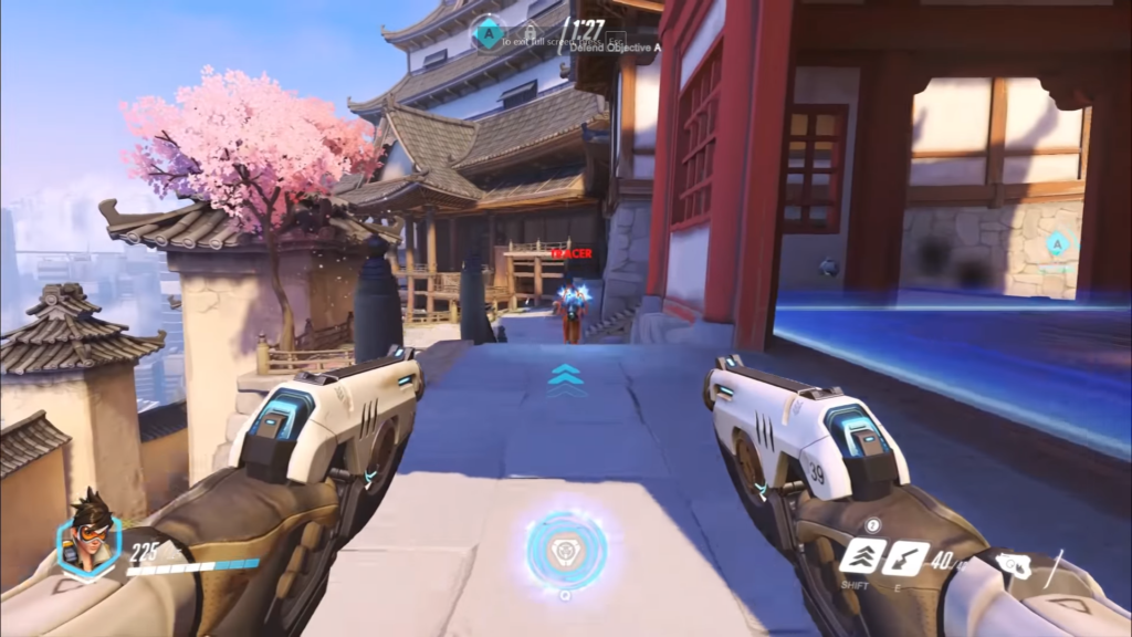
This is a screenshot from map “Hanamura”. On the right side is the objective point. Players need to focus on this area to play against the opposite team.
Turn the screenshot into grayscale and lower the luminance down.
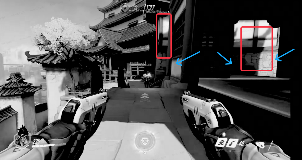
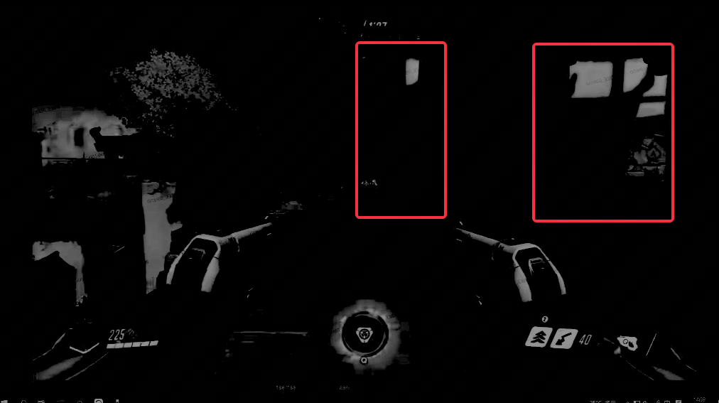
It’s easy to notice that the area with high luminance(marked with red) is where the entrance is located. The area marked with blue arrows is where the opposite team player may jump into the scene at any second.
I believe the developer is doing this intentionally, not by accident. The purpose is to have players’ attention on those areas, so they don’t need to dig around searching for enemies.
Example: Clear Brightness Grading For Critical Area
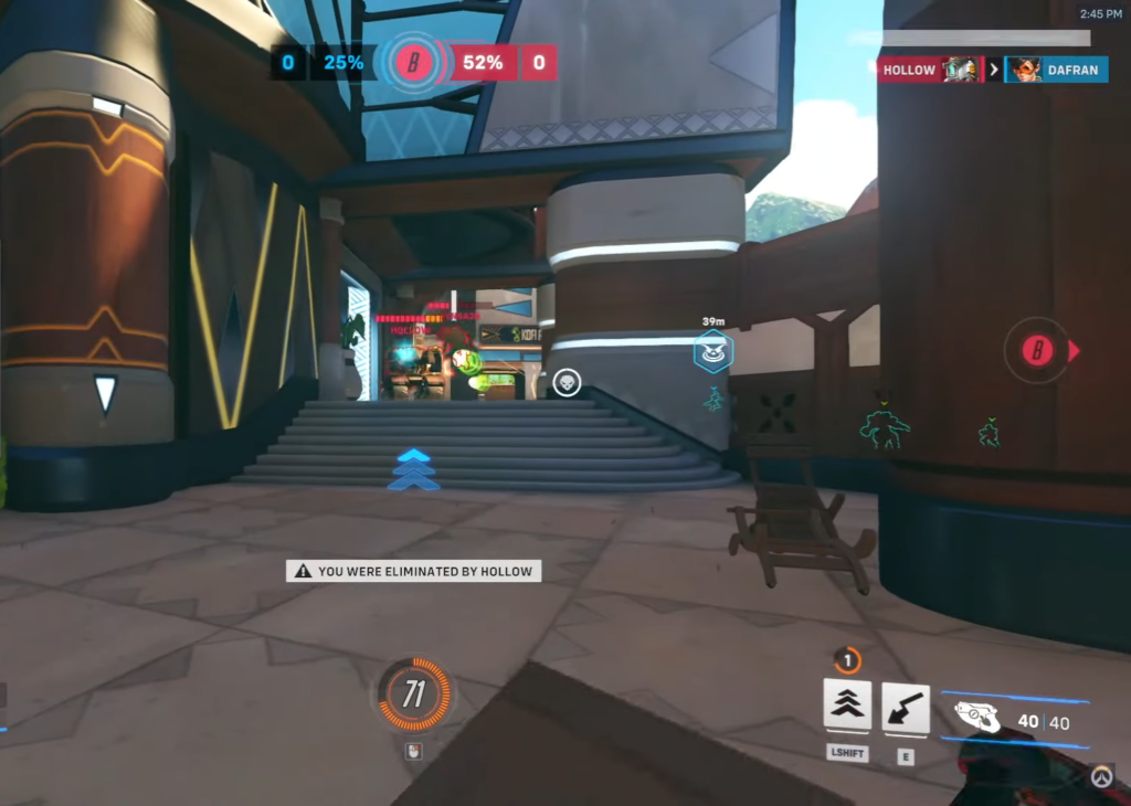
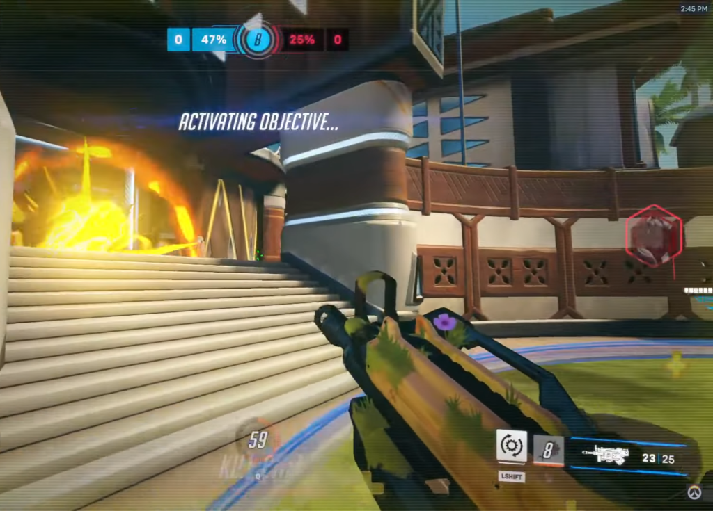
These two locations shown above have a similar “V” shape yellow lightbar.

After applying the same filter to those images. The “V” shape lightbar in the left screenshot completely disappeared. But, the right screenshot the “V” shape lightbar can be easily noticed.
Even the lighting condition variety is pretty much the same as the “V” shape lightbar. The lightbar marked with green has no brightness difference at all.
The purpose is the same as in example 1. Try to guide the players’ eyes to the important area of the screen which is marked with blue arrow. This contributes to the game’s playability.
Genshin Impact
Example: Consistency & Clear Brightness Grading
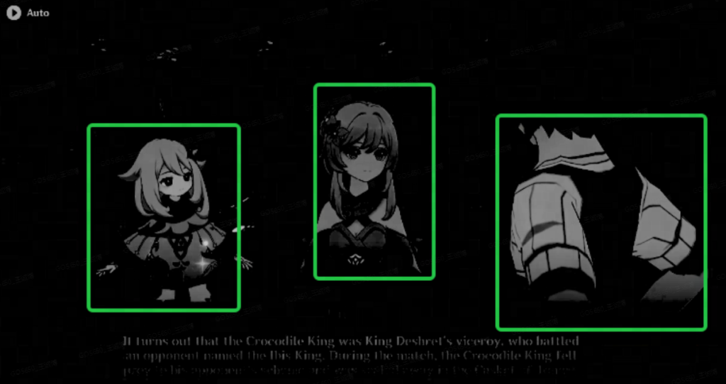
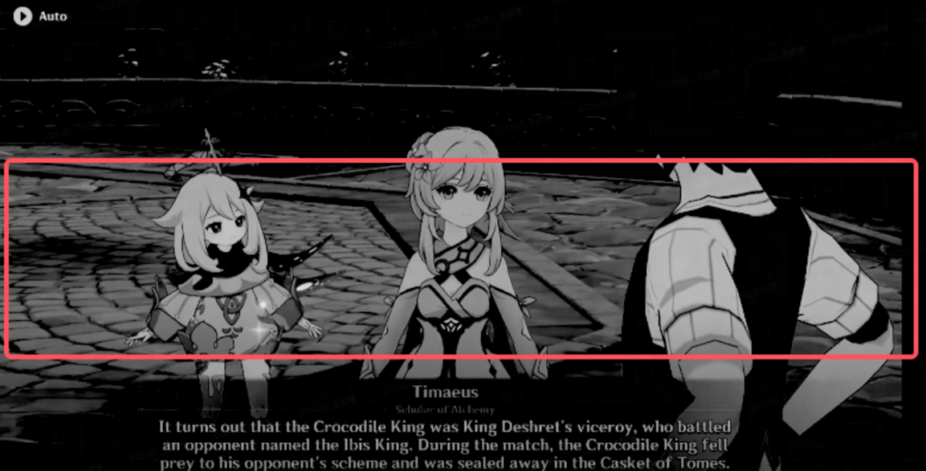
- Layer1: Character
- Layer2: Background
Obvious brightness grading between character and background, makes graphic easy to pick up.
Pokemon: Unite
Example: Consistency & Clear Brightness Grading

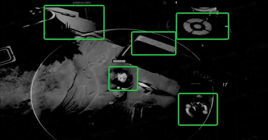
- Layer1: Goal Point / Character / Health Bar / Obstacle
- Layer2: Background
Same as Genshin Impact. Obvious brightness grading between character and background, makes graphic easy to pick up.
